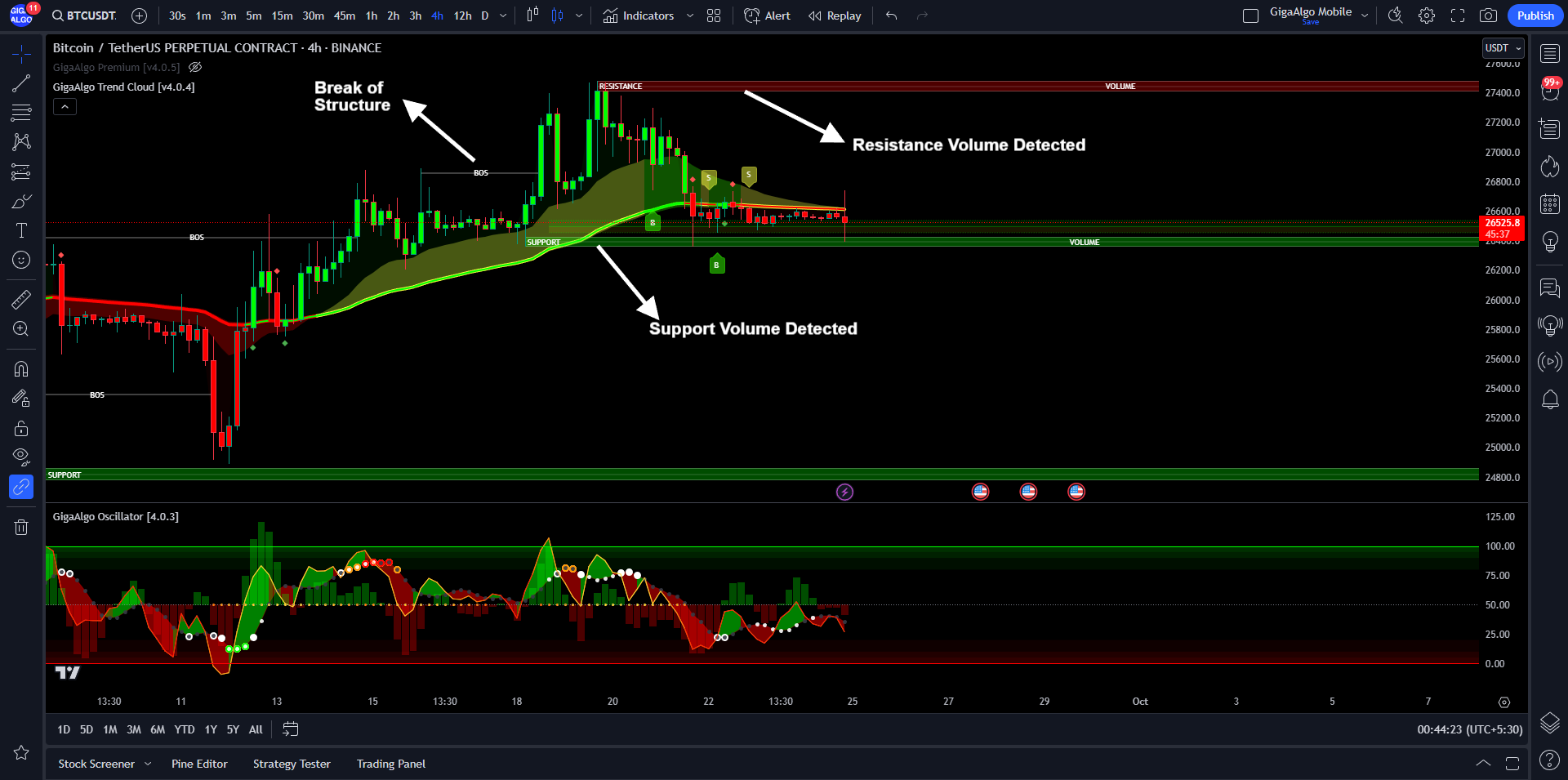
The GigaAlgo Trend Cloud indicator provides traders with insights into support and resistance zones on a price chart. Understanding these support and resistance zones is essential for making informed trading decisions. Here’s a brief explanation of the terms used in the context of this indicator:
- BOS (Break of Structure): A “break of structure” is a technical analysis concept that refers to a significant change in the pattern or trend of an asset’s price movement. It occurs when the price moves beyond a previously established support or resistance level, signaling a potential shift in market sentiment.
- Red Zone (Resistance Volume Area): In the context of the GigaAlgo Trend Cloud indicator, the “red zone” represents a region on the chart where resistance levels are detected. Resistance refers to a price level at which selling pressure tends to be strong, preventing the price from rising further. Traders often pay attention to these zones as potential barriers to upward price movements.
- Green Zone (Support Volume Area): The “green zone” indicates an area on the chart where support levels are detected. Support is a price level at which buying interest tends to be strong, preventing the price from falling further. Traders look at these zones as potential areas where price reversals or bounces may occur.
In summary, the GigaAlgo Trend Cloud indicator helps traders identify key support and resistance zones on the price chart. These zones are marked by the red and green areas, respectively. Recognizing these levels can aid traders in making decisions about entry and exit points, as well as understanding potential areas of price reversal or continuation. It’s important to use these zones in conjunction with other technical analysis tools and market information to form a well-rounded trading strategy.
Understanding the Support and Resistance Zones:
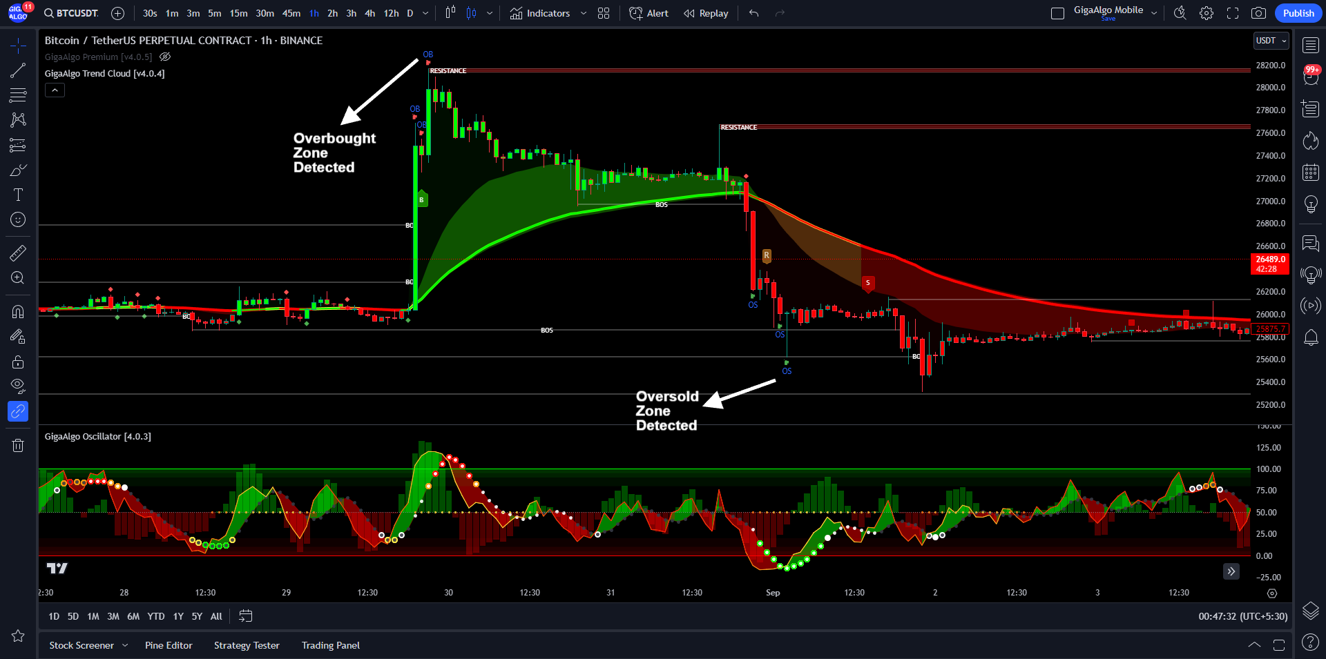
Understanding overbought and oversold markers is crucial for traders, as they provide insights into potential market reversals or corrections. Here’s an explanation of these terms in the context of trading:
- Overbought (OB) Zone:
- When an asset is in the overbought zone, it means that its price has experienced a significant and rapid increase, often to the point where it may be considered overvalued.
- In this zone, buying interest has been strong, and the asset’s price has likely risen too quickly, potentially reaching a level that is unsustainable in the short term.
- Traders often view the overbought condition as a signal that a price correction or pullback may be imminent. It suggests that there might be too much buying pressure, and profit-taking or selling may follow.
- Oversold (OS) Zone:
- Conversely, when an asset is in the oversold zone, it means that its price has experienced a significant and rapid decline, often to the point where it may be considered undervalued.
- In this zone, selling pressure has been strong, and the asset’s price has likely fallen too quickly, potentially reaching a level that is unsustainable in the short term.
- Traders often view the oversold condition as a signal that a price rebound or recovery may be on the horizon. It suggests that there might be too much selling pressure, and buyers may step in to take advantage of lower prices.
In summary, overbought and oversold markers, such as those labeled OB and OS on a chart, are used by traders as part of technical analysis to identify potential turning points in the market. These markers can help traders make decisions about when to enter or exit positions based on the perceived levels of buying or selling pressure. However, it’s essential to use these markers in conjunction with other technical indicators and analysis techniques to make well-informed trading decisions.
Understanding the Overbought and Oversold Markers:
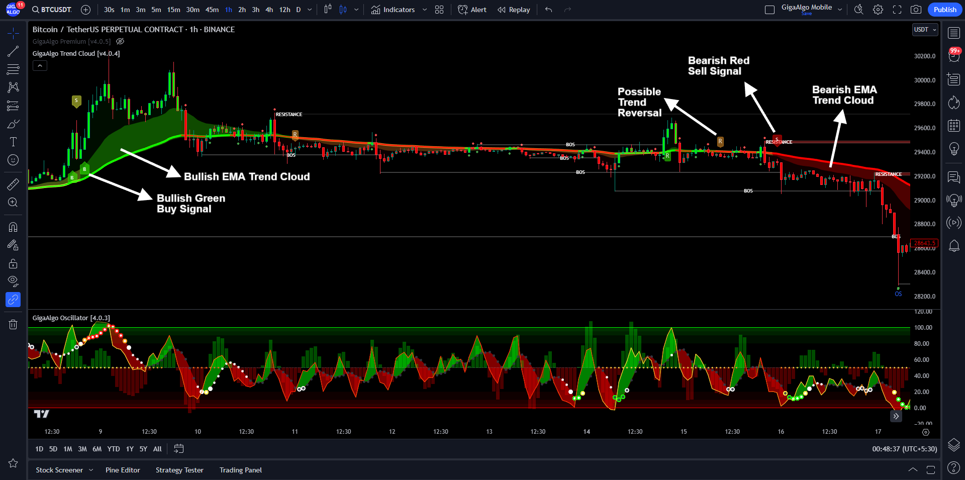
The GigaAlgo Trend Cloud indicator offers traders a powerful toolset for analyzing market conditions and making informed trading decisions. Central to this system is the utilization of Exponential Moving Averages (EMAs) to generate buy and sell signals and to determine the prevailing market trends. Here’s an overview of how EMAs are integrated into the GigaAlgo indicator system:
Bullish EMA Trend Cloud (Green Color):
- A “bullish” market trend signifies a prevailing upward price movement and a positive market sentiment.
- The “EMA Trend Cloud,” visually represented by a vibrant green color, serves as a visual confirmation of this robust uptrend in the asset’s price. It is primarily based on Exponential Moving Averages (EMAs) and provides a clear signal of the bullish market sentiment.
Bullish Green Buy Signals (Labeled with “B”):
- Within this bullish market context, “bullish green buy signals” are strategically generated, indicating opportune moments to consider initiating long positions.
- These buy signals, distinctly labeled with a “B,” are derived from the analysis of EMAs and signify potential entry points for traders who seek to capitalize on the upward price momentum.
Bearish EMA Trend Cloud (Red Color):
- Conversely, a “bearish” market trend indicates a predominant downward price movement and a negative market sentiment.
- The “EMA Trend Cloud,” visually depicted with a prominent red hue, graphically illustrates the strength of the downtrend in the asset’s price. This depiction is predominantly rooted in the analysis of Exponential Moving Averages (EMAs) and conveys the bearish market sentiment.
Bearish Red Sell Signals (Labeled with “S”):
- In the context of this bearish market scenario, “bearish red sell signals” are judiciously generated, signifying suitable instances to contemplate exiting or shorting positions.
- These sell signals, easily distinguishable by the “S” label, are generated based on the analysis of EMAs, offering potential exit points for traders aiming to profit from the downward price trajectory.
Possible Trend Reversal (Labeled with “R” Upward or Downward):
- The “possible trend reversal” markers are a noteworthy component of the GigaAlgo indicator system, offering insights into potential shifts in market direction.
- An “R” label pointing upward signifies the potential for a bullish trend reversal, indicating that a prevailing downtrend may transition into an upward trajectory. This assessment relies on the analysis of EMAs.
- Conversely, an “R” label pointing downward suggests the possibility of a bearish trend reversal, where an existing uptrend may transform into a downtrend. This evaluation is underpinned by the analysis of EMAs.
In conclusion, the GigaAlgo indicator system seamlessly integrates Exponential Moving Averages (EMAs) to generate buy and sell signals, as well as to visualize prevailing market trends through the EMA Trend Cloud. These indicators, marked by distinct colors and labels, provide traders with invaluable insights into market sentiment, potential entry and exit points, and possible trend reversals. However, it’s important for traders to complement these signals with comprehensive market analysis and risk management strategies for well-rounded trading decisions.
Understanding the Buy and Sell Signals with EMA:
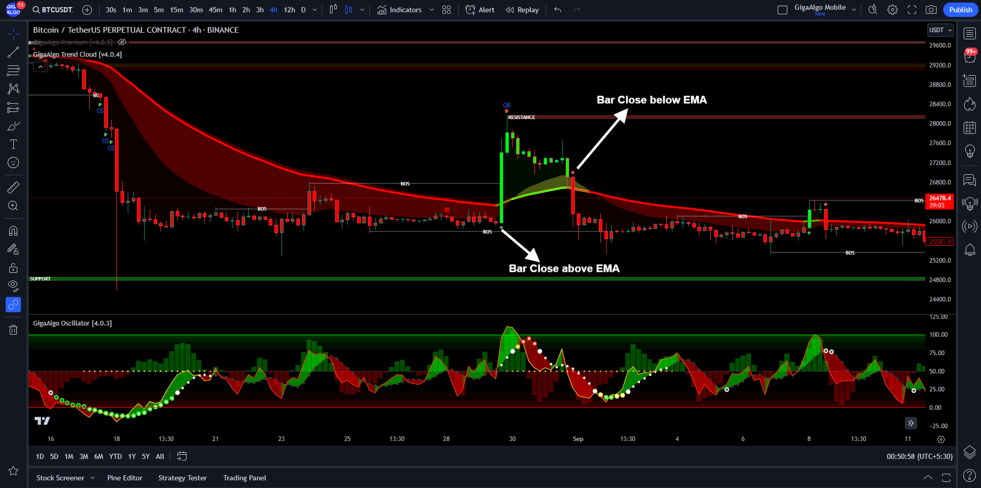
Understanding the EMA diamonds is crucial for traders using the GigaAlgo indicator system, as they provide valuable insights into the relationship between price movements and Exponential Moving Averages (EMAs). Here’s an explanation of these EMA diamonds:
- Green Diamond (Price Closes Above EMA):
- When the price of an asset closes above the EMA, it triggers the appearance of a green diamond on the chart.
- This green diamond serves as a visual indicator that the current price is above the EMA, signifying potential bullish momentum.
- It may also suggest the start of a bullish trend cloud based on EMA, where the EMA-based trend is likely to align with an upward price movement.
- Red Diamond (Price Closes Below EMA):
- Conversely, when the price of an asset closes below the EMA, it results in the display of a red diamond on the chart.
- The red diamond visually indicates that the current price is below the EMA, potentially signaling a bearish sentiment.
- It may also imply the commencement of a bearish trend cloud based on EMA, where the EMA-based trend is expected to coincide with a downward price movement.
In summary, the EMA diamonds offer traders a clear and visual representation of the relationship between price action and Exponential Moving Averages (EMAs). A green diamond suggests that the price is currently trading above the EMA, indicating potential bullishness, while a red diamond indicates that the price is trading below the EMA, implying possible bearish sentiment. Additionally, these diamonds may coincide with the initiation of trend clouds based on EMA analysis, further assisting traders in assessing market conditions and making informed trading decisions. It’s essential for traders to consider these EMA diamonds in conjunction with other technical analysis tools and strategies for comprehensive market analysis.
Understanding the EMA diamonds:
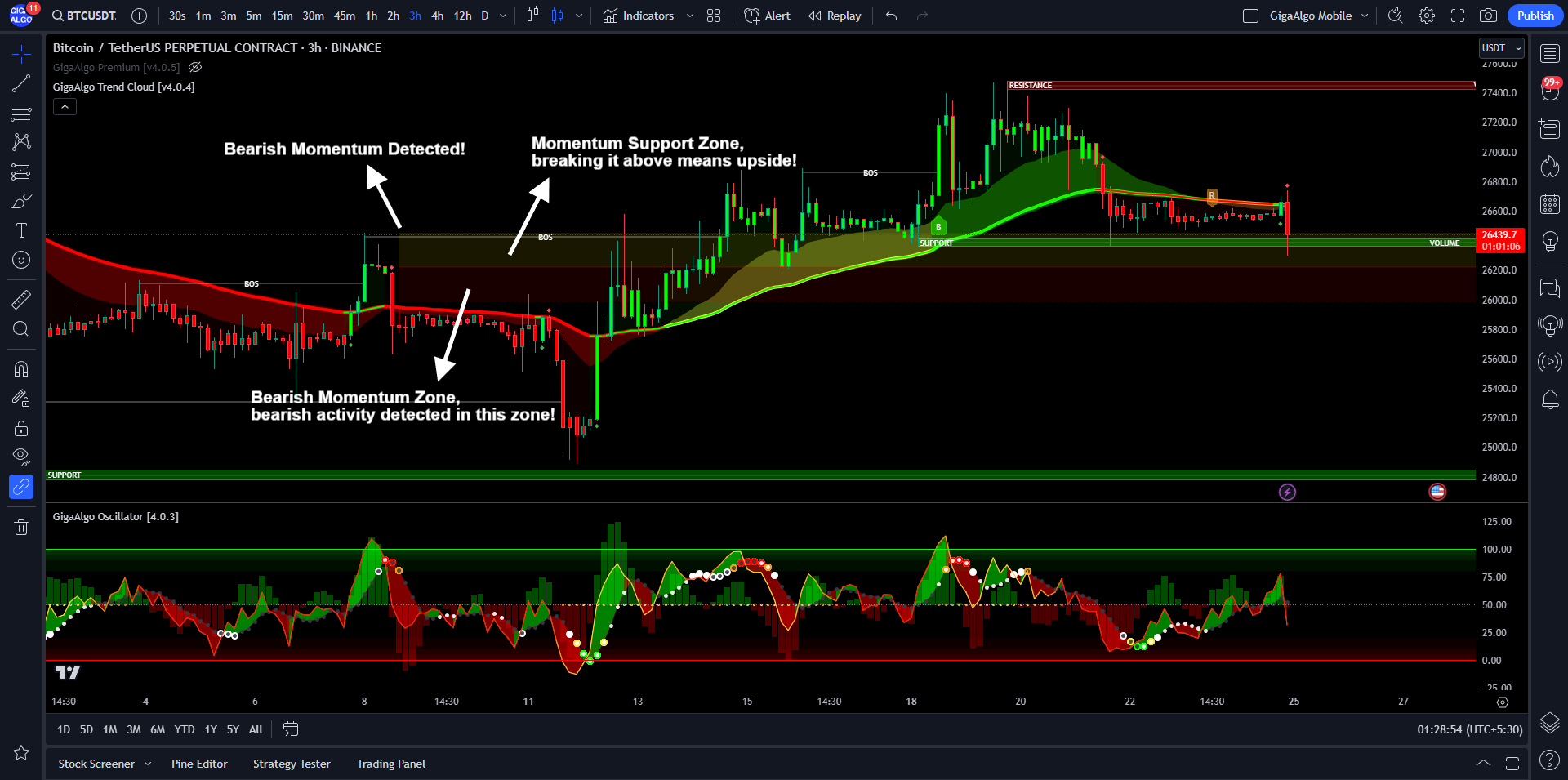
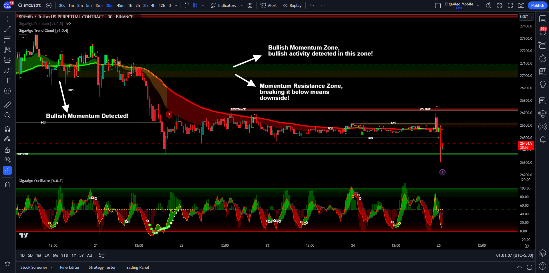
Understanding bullish and bearish momentum zones is crucial for traders as they provide insights into the strength and direction of market trends. Here’s an explanation of these zones in the context of order blocks and candlestick patterns:
- Bullish Momentum Zone:
- The bullish momentum zone is characterized by a series of consecutive bullish candles appearing on the price chart.
- These bullish candles signify periods of strong buying pressure and upward price momentum.
- Traders often identify the bullish momentum zone as a region where the market is experiencing sustained optimism, with buyers dominating and pushing prices higher.
- This zone may indicate a strong uptrend and can be used as a reference point for potential entry or support levels for long trades.
- Bearish Momentum Zone:
- Conversely, the bearish momentum zone is marked by a sequence of consecutive bearish candles on the price chart.
- These bearish candles represent periods of robust selling pressure and downward price momentum.
- Traders recognize the bearish momentum zone as a segment where market sentiment is predominantly negative, with sellers exerting control and driving prices lower.
- The bearish momentum zone may suggest a pronounced downtrend and can serve as a reference for potential entry or resistance levels for short trades.
- Order Blocks:
- Order blocks are specific price levels or zones on a chart where significant buy or sell orders are concentrated.
- These zones are often identified based on key support and resistance levels, as well as price action patterns.
- Order blocks can act as areas of price consolidation, where market participants are awaiting significant price movements or reversals.
- Traders pay attention to order blocks as they can influence future price movements when price eventually breaks out of these consolidation zones.
In summary, bullish and bearish momentum zones are recognized through patterns of consecutive bullish or bearish candles on a price chart. These zones provide insights into the prevailing market sentiment and the direction of price momentum. Additionally, order blocks represent areas of price consolidation where significant buying or selling orders may be clustered. Traders use these zones and patterns as part of their technical analysis to make informed decisions about entering or exiting trades and identifying potential support and resistance levels.
Understanding the Bullish Momentum Zone:
Understanding the Bearish Momentum Zone: